blog»Content Marketing»The Power of Micro-Copy: Tiny Words That Drive Big Results in E-Commerce
The Power of Micro-Copy: Tiny Words That Drive Big Results in E-Commerce
2025/04/16
You can read this article in about 15 minutes
Introduction
When we talk about improving conversions, most marketers think about headlines, pricing, or product photos. But what if the real difference was hidden in the tiny details—like the words on your buttons, form fields, or error messages?
That’s where micro-copy comes in.
Micro-copy is the small, functional text that guides users through your website. It helps people take action, feel confident, and move forward—without even realizing it. And in e-commerce, that can mean the difference between a bounce and a sale.
In this article, we’ll show you how to spot, write, and improve micro-copy across your store. You’ll learn how these short bits of copy help build trust, ease hesitation, and quietly increase your conversion rate—one word at a time.
Let’s dive into the details that really matter.
2. What is Micro-Copy?
Micro-copy is the small text most people barely notice—but it plays a huge role in how they experience your site.
It’s not your headlines, blog content, or product descriptions. It’s the short, functional bits of copy that guide users, reduce confusion, and help them take action. And in e-commerce, it shows up everywhere.
Micro-copy examples:
- A button that says “Add to Bag” instead of “Submit”
- A line under a form field that says, “We’ll never spam you”
- A product page note like “Order in the next 2 hours for same-day shipping”
- A reassuring message at checkout: “You can return within 30 days—no questions asked”
- A playful 404 page that says “Oops! Looks like you took a wrong turn”
Micro-copy helps shape tone, trust, and clarity. It removes friction, reduces hesitation, and reassures shoppers when they need it most.
These aren’t just words—they’re nudges. And in many cases, they’re the final push that turns a visitor into a customer.
3. Where Micro-Copy Lives on an E-Commerce Site
Once you start looking for it, micro-copy is everywhere. It lives in the moments that guide your customer—before, during, and after a purchase.
Let’s break it down by where it matters most on your site:
Product Pages
- Size guides: “Runs small – consider sizing up.”
- Shipping info: “Free delivery by Friday if you order within 3 hours.”
- Stock alerts: “Only 2 left in stock!”
- Return info: “Easy 30-day returns. No hassle.”
These little messages build clarity and confidence—which leads to faster buying decisions.
Add-to-Cart and CTA Buttons
- “Add to Bag” feels more personal than “Submit”
- “Get Yours Today” creates more urgency than “Buy Now”
- Try split testing CTAs to see what wording drives the best clicks
This is micro-copy at its most powerful: short, action-driven, and visible.
Forms and Checkout Fields
- Placeholder text: “Enter your email for order updates”
- Password field: “Must include 8 characters and a number”
- Billing address tips: “We’ll only use this to send your order”
- Error message: “Oops! Looks like something’s missing”
Helpful micro-copy here reduces friction and form abandonment.
Popups and Lead Capture
- Instead of “Subscribe to our newsletter,” try:
“Get early access to new drops and private sales” - Add reassurance: “We only send the good stuff. No spam.”
Micro-copy here determines whether people stay—or click away.
Error Pages and Empty States
- 404 message: “Oops! We lost the page… but here are some top picks.”
- Empty cart: “Your cart’s empty… but not for long, right?”
- Out of stock: “Join the waitlist and we’ll let you know first.”
Even in the “dead zones” of your site, micro-copy can turn frustration into engagement.
Post-Purchase Pages
- Order confirmation: “You’re all set! We’ll email you a tracking link shortly.”
- Upsells or referrals: “Loved your order? Share it with a friend and get 10% off.”
Micro-copy doesn’t stop at checkout—it helps build loyalty and return visits too.
These little words shape your customer’s entire experience—from curiosity to confidence to conversion.
4. The 8 Principles for Writing Better Micro-Copy
Writing great micro-copy isn’t about being clever—it’s about being helpful. These small bits of text need to guide, reassure, and motivate your users in as few words as possible.
Here are 8 simple principles to help you write micro-copy that works:
1. Be Clear Before Clever
Don’t try to be witty if it means people get confused.
- “Add to Cart” is better than “Let’s Do This”
2. Use Human, Natural Language
Write how people speak. Avoid robotic or overly technical terms.
- “We’ll email your receipt” is friendlier than “A confirmation will be sent electronically”
3. Make It Personal (When It Makes Sense)
Speak directly to your user. Use “you” and “your” to create connection.
- “We’ll never share your info” feels more trustworthy than “Your data will remain confidential”
4. Guide Action Clearly
CTAs should be direct, easy to understand, and action-oriented.
- “Get My Discount” is stronger than “Submit” or “Continue”
5. Add Context That Reassures
Explain why you’re asking for info or what happens next.
- “Your phone number is only used for delivery updates”
6. Match Your Brand’s Voice
Stay consistent—whether you’re fun, premium, or minimalist. But don’t overdo it.
- A playful tone works, but it still has to be functional
7. Test and Optimize What Matters Most
Even small changes to CTA buttons, tooltips, or checkout hints can impact performance.
- A/B test things like: “Buy Now” vs. “Shop the Look”
8. Keep It Short (Especially on Mobile)
Space is limited, especially on phones. Every word counts.
- Trim fluff. If it doesn’t help the user move forward, cut it.
These principles apply across your entire site—from product pages to checkout. And the best part? Most changes take just a few minutes to implement.
5. Real Examples: Micro-Copy That Works
Let’s bring it to life. Below are real-world examples from e-commerce brands using micro-copy to build trust, reduce friction, and drive action—without needing more than a sentence or two.
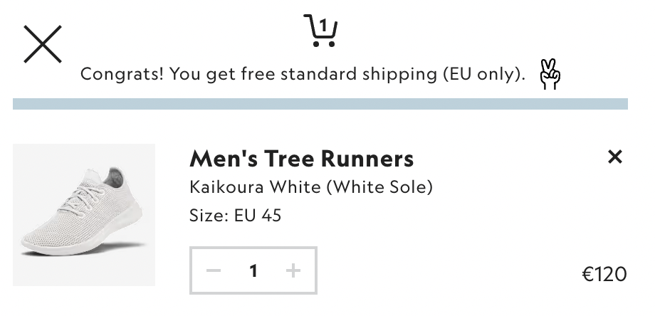
Allbirds – Product Page Shipping Info
“Congrats! You get free shipping”
This tiny line right on top of the basket reduces hesitation and tells the shopper, “you’ve got nothing to lose.” It’s short, calm, and confident—like the brand.
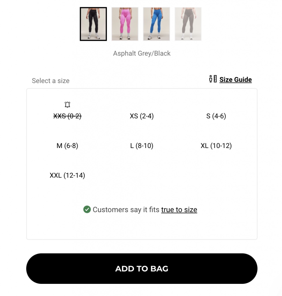
Gymshark – Add-to-Cart Button
“Add to Bag” instead of “Add to Cart”
A small word choice that aligns with their youthful, fashion-forward tone. “Bag” sounds more personal and lifestyle-oriented. It’s subtle—but consistent.
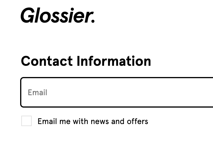
Glossier – Email Form Micro-Copy
“Email me with news and offers”
This removes spam anxiety and helps increase sign-ups. It’s conversational, on-brand, and sets the tone for what to expect.
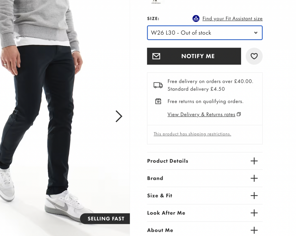
ASOS – Out of Stock Message
“Out of stock – Notify me”
A friendly message that acknowledges the disappointment while quickly redirecting the user to keep browsing—reducing drop-off.
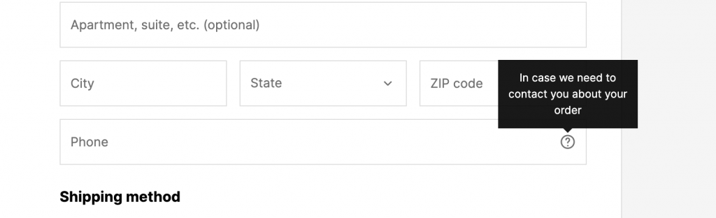
Shopify Checkout – Field Labels & Help Text
Field: “Phone number”
Help text: “Used for shipping updates only”
This tiny line increases trust and reduces drop-off during checkout. Without it, users might hesitate to share personal info.
Each of these examples shows that micro-copy doesn’t have to be fancy—it just has to be intentional. It’s the smallest layer of your brand voice, but often the most noticed when it’s missing.
6. How to Start Improving Your Own Site’s Micro-Copy
You don’t need to redesign your store or rewrite everything to make a difference. Start small. Focus on the moments that matter most—and refine the copy where it guides, reassures, or converts.
Here’s how to get started:
Step 1: Audit Your Key Touchpoints
Look at your site through the eyes of a first-time visitor.
Make a checklist of micro-copy moments:
- Product pages
- CTA buttons
- Forms and checkout
- Popups or lead capture
- Empty states and errors
- Order confirmation pages
Write down what feels unclear, cold, or robotic—and what could be more helpful or human.
Step 2: Start Rewriting One Section at a Time
Focus on the most visited pages or highest-drop-off points first.
Ask yourself:
- Is this message clear?
- Does it feel like us?
- Is it helping the customer move forward?
Don’t overthink tone—just aim for clear, friendly, and human.
Step 3: Test and Learn What Works
Use A/B tests to compare micro-copy versions on:
- Button labels
- Error messages
- Popups and lead forms
- Shipping and return info
You can also use heatmaps (like Ptengine) or screen recordings to see where people hesitate or drop off. That’s usually where the copy needs a fix.
Step 4: Work With UX and Design
Micro-copy often lives between marketing and product.
So bring your designers and UX teammates into the process—collaborate to make small changes with a big impact.
Improving micro-copy doesn’t require a big budget or a long timeline. In fact, you can probably rewrite your most important CTAs or error messages today—and start seeing results faster than you think.
7. Conclusion: The Small Stuff Is the Big Stuff
It’s easy to focus on the big things—ads, product images, promotions. But in e-commerce, it’s often the smallest details that shape the buying experience.
Micro-copy is where your brand meets action. It’s how you build trust, remove friction, and guide people from “maybe” to “yes.”
By improving a few lines of text—on a button, under a form, or at checkout—you’re not just tweaking copy. You’re improving how your store feels to shop in. And that can lead to more conversions, better user experience, and happier customers.
So here’s your next move:
- Start small
- Audit the key areas
- Make your copy more human
- Test what works
- Keep refining
Because great marketing doesn’t just live in your campaigns. It lives in the moments between the clicks.