blog»Conversion Rate Optimization»5 A/B-Testing Mistakes Marketers Should Avoid for Better Results
5 A/B-Testing Mistakes Marketers Should Avoid for Better Results
2024/08/05
You can read this article in about 21 minutes
Introduction
A/B testing is one of the most effective tools in an e-commerce marketer’s arsenal. It allows you to make data-driven decisions, optimize your website, and ultimately, increase conversions. However, while A/B testing might seem straightforward, it’s easy to make mistakes that can lead to skewed results and missed opportunities. These errors can cost you time, money, and even potential sales.
Many marketers dive into A/B testing with enthusiasm, eager to see what works best for their audience. But without careful planning and a solid understanding of the process, it’s easy to fall into common traps. Whether it’s testing too many variables at once, not running tests long enough, or overlooking the importance of sample size, these mistakes can seriously undermine your efforts.
In this article, we’ll cover five of the most common A/B-testing mistakes that e-commerce marketers make. We’ll explain why these mistakes are problematic and how you can avoid them to ensure your testing efforts are accurate and beneficial. By steering clear of these pitfalls, you’ll be able to make more informed decisions that genuinely move the needle for your business.
Whether you’re new to A/B testing or looking to refine your approach, understanding these common mistakes is the first step toward improving your testing strategy. Let’s dive in and make sure your next test is set up for success.
Mistake 1: Testing Too Many Variables at Once
One of the most common A/B testing mistakes is trying to test too many variables at once. When you’re eager to see big results, it’s tempting to change several elements on a page simultaneously—like the headline, the call-to-action button, and the images. But this approach can lead to confusing outcomes and make it nearly impossible to pinpoint what really caused any changes in performance.
Think of it this way: if you’re running a test where you change both the headline and the button color, and you see a 10% increase in conversions, how do you know which change made the impact? Was it the headline that captured more attention, or was it the new button color that enticed more clicks? When you test multiple variables at once, you lose the ability to understand the individual effect of each change.
For example, let’s say you’re testing a product page. You decide to test a new headline that highlights a product benefit, a brighter “Add to Cart” button, and a different product image—all at the same time. After running the test, you notice that conversions have increased, but you can’t tell which change was responsible. If the new headline was the driving force behind the improvement, you might be wasting resources on the other changes that didn’t contribute much—or worse, changes that might have had a negative impact if tested individually.
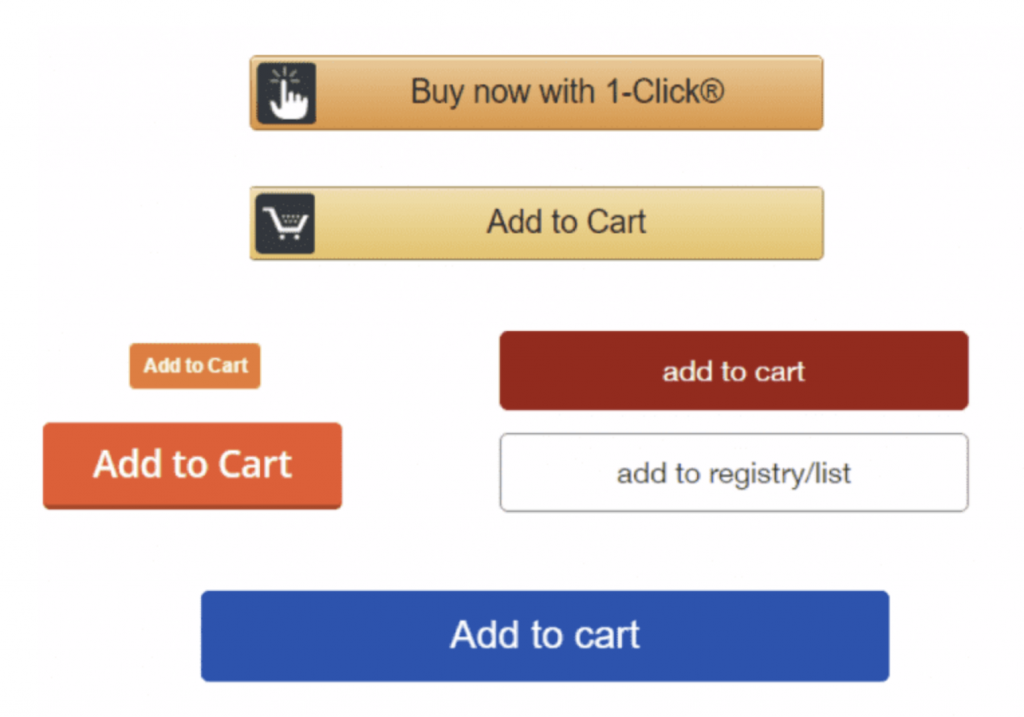
To avoid this mistake, focus on testing one element at a time. Start with the change you believe will have the most significant impact. If you’re curious about multiple elements, run separate tests for each one. This way, you can clearly see which specific change drives the desired outcome and make more informed decisions moving forward.
Remember, A/B testing is about precision. By isolating variables, you can better understand what truly resonates with your audience and make more effective improvements to your e-commerce site.
Mistake 2: Not Running Tests Long Enough
Another critical mistake in A/B testing is not allowing your tests to run for a sufficient amount of time. It’s natural to want quick results, especially when you’re eager to implement changes that could improve your site’s performance. However, ending a test too early can lead to misleading conclusions, potentially causing you to make decisions based on incomplete or inaccurate data.
Consider this: You launch an A/B test on your homepage, comparing two different headlines. After just a few days, you notice that one version is outperforming the other by a significant margin. Excited by the apparent success, you decide to end the test and implement the winning headline across your site. But what if that initial spike in performance was just a fluke—a result of random fluctuations in traffic, or perhaps a temporary surge in interest due to an unrelated event? By ending the test prematurely, you might have missed out on seeing the longer-term trend, which could have shown that the difference in performance wasn’t as significant as it first appeared.
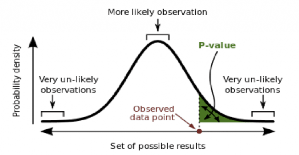
For example, imagine you run a test for a week, and the first few days show a strong preference for one variant. However, as the test continues, the results start to even out, and by the end of the week, the difference between the two versions is minimal. If you had stopped the test after those initial days, you would have wrongly concluded that one version was a clear winner, potentially leading to a decision that doesn’t actually benefit your business.
To avoid this mistake, make sure your tests run long enough to gather a substantial amount of data. A good rule of thumb is to let the test run for at least two weeks or until you’ve reached statistical significance. This timeframe helps account for variations in traffic patterns and user behavior, providing you with more reliable results.
Patience is key in A/B testing. By allowing your tests to run their full course, you’ll ensure that your decisions are based on accurate data, leading to more effective optimizations and better outcomes for your e-commerce site.
Mistake 3: Ignoring the Importance of Sample Size
One of the most overlooked aspects of A/B testing is ensuring that your sample size is large enough to produce reliable results. It’s easy to get excited when you see early signs of a winning variant, but if your sample size is too small, those results might be nothing more than a coincidence. Making decisions based on insufficient data can lead to implementing changes that don’t actually benefit your site—or worse, changes that negatively impact your performance.
Let’s break this down with an example. Imagine you run a test on your checkout page, comparing two different button designs. After a few hundred visitors, you notice that one design is leading to a 20% increase in conversions. It’s tempting to call it a win and roll out the new design site-wide. But if your traffic is relatively low, a few conversions here and there can significantly skew the results. That 20% increase might just be a result of random chance rather than a true preference for the new design.
Now, consider what happens when you let the test run longer and gather more data. As more visitors participate in the test, the results might start to shift. That 20% increase could level out to something much smaller—or even disappear entirely. Without a large enough sample size, you risk basing your decisions on data that isn’t truly representative of your audience’s behavior.
For instance, a small sample might include an unusual number of visitors from a particular demographic that just happens to prefer one design over the other. As your sample size grows, the test results will start to reflect the broader audience, giving you a more accurate picture of which design is genuinely more effective.
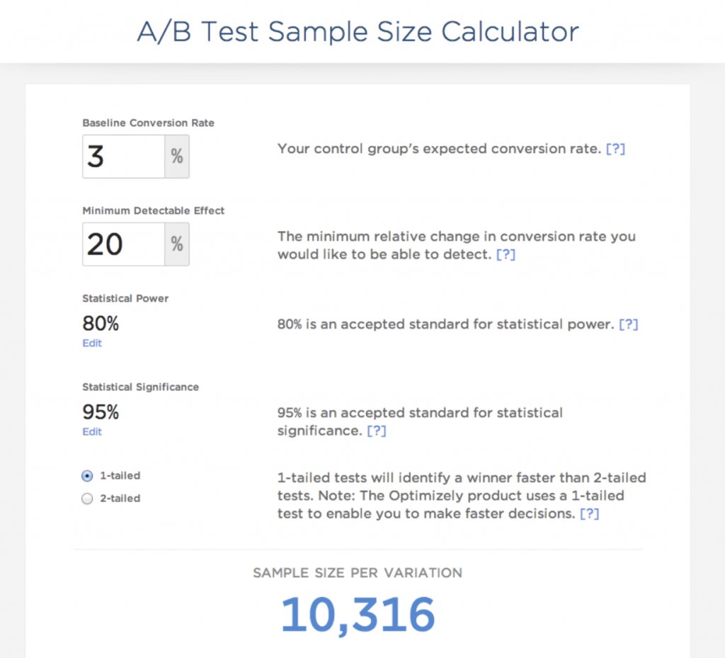
To avoid this mistake, use a sample size calculator to determine how many visitors you need before you start your test. This will vary depending on your traffic levels and the expected difference in performance between the variants. By ensuring that your sample size is large enough, you’ll be able to trust that the results of your A/B test are valid and actionable.
Mistake 4: Focusing Only on Clicks
When running A/B tests, it’s easy to get fixated on clicks as the primary metric of success. After all, more clicks often suggest that a particular variation is resonating with your audience. However, clicks alone don’t always tell the whole story. Focusing solely on this metric can lead to misleading conclusions and might result in changes that don’t actually improve your bottom line.
Let’s consider an example. You’re testing two different versions of a banner on your homepage. The goal is to see which one drives more clicks to a product page. After running the test for a week, you see that Version A is getting 30% more clicks than Version B. It might seem like an obvious choice to go with Version A, but what if those extra clicks aren’t leading to more sales? What if visitors are clicking on Version A more often but then quickly bouncing from the product page because the messaging doesn’t match their expectations?
In this case, focusing only on clicks could lead you to implement a change that actually decreases your conversion rate. The clicks may have increased, but if they’re not translating into meaningful actions—like purchases, sign-ups, or other key conversions—then the change isn’t truly benefiting your business.
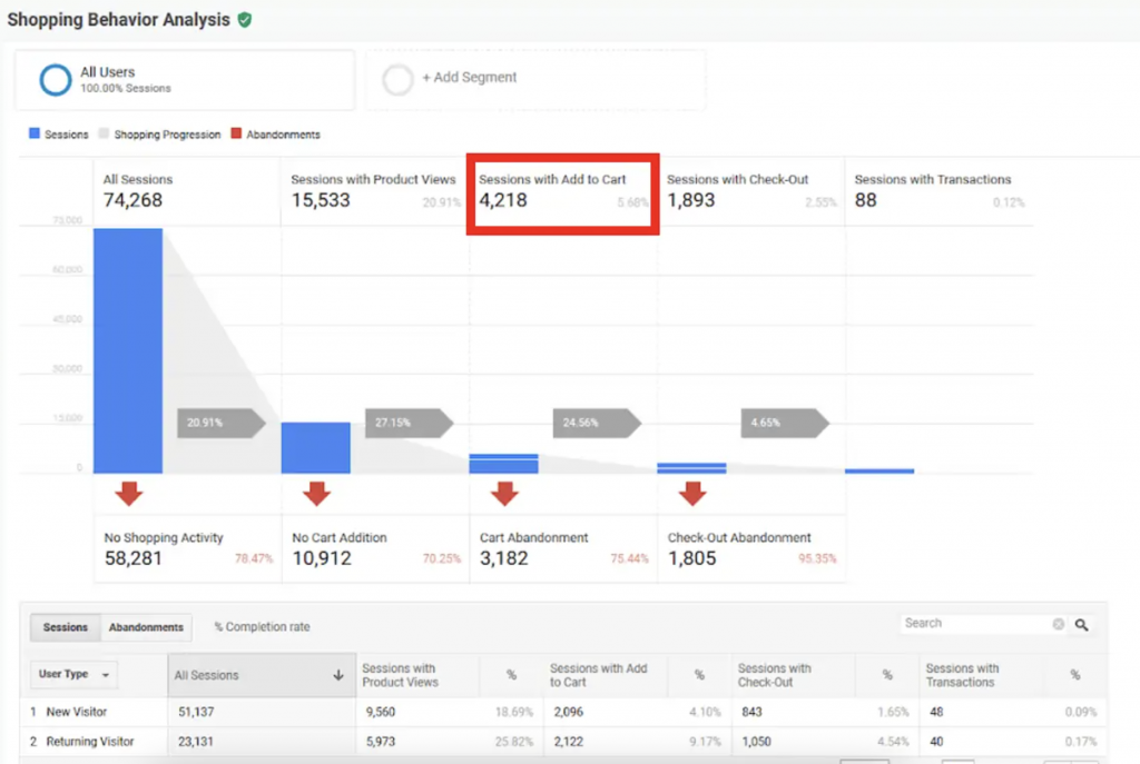
For example, if you’re running an A/B test on a product page and focusing only on the number of clicks to the checkout button, you might miss the fact that one version actually has a higher abandonment rate at the checkout stage. Perhaps Version B, while receiving fewer clicks, results in more completed purchases because the information provided is more comprehensive or the user experience is smoother.
To avoid this mistake, always consider multiple metrics when evaluating your A/B tests. Look beyond clicks to other key performance indicators (KPIs) like conversion rate, average order value, or even revenue per visitor. These metrics will give you a more complete picture of how each variation is performing and help ensure that the changes you make are truly driving your business forward.
Mistake 5: Not Segmenting Your Audience
One of the most significant yet often overlooked mistakes in A/B testing is failing to segment your audience. Your website visitors are not a monolithic group; they differ in many ways, such as their behavior, demographics, and how they found your site. By treating all visitors the same in your A/B tests, you might miss out on valuable insights that could help you tailor your site to different segments of your audience.
Imagine you’re running an A/B test on your homepage, comparing two different layouts. You notice that Version A is slightly outperforming Version B in terms of overall conversions. Based on this, you decide to implement Version A for all users. However, what you didn’t realize is that Version A performs well with new visitors but actually lowers conversions among returning customers. By not segmenting your audience, you’ve implemented a change that might alienate a loyal customer base.
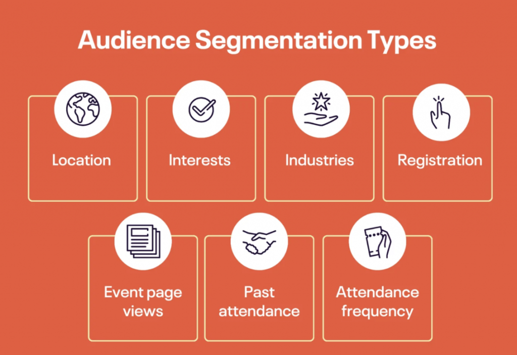
For example, let’s say you operate an ecommerce site that sells both luxury and budget-friendly products. Your audience likely includes different types of shoppers—those looking for premium items and those looking for deals. If you run an A/B test on a product recommendation section without segmenting your audience, you might find that one version seems to perform better overall. But when you dig deeper, you could discover that this version only appeals to one group (e.g., deal hunters), while the other group (e.g., luxury shoppers) actually prefers the other version.
By not segmenting your audience, you miss the chance to optimize your site for different types of users. Instead, segment your audience by factors such as new versus returning visitors, traffic source (organic, paid, social media, etc.), or customer type (e.g., high-spending versus budget-conscious). Running A/B tests within these segments allows you to see how different versions perform for different groups. You might find that one version is better for new visitors, while another works best for returning customers.
Conclusion
A/B testing is a powerful tool for optimizing your ecommerce site, but it’s only effective when done right. Avoiding common mistakes—such as testing too many variables at once, not running tests long enough, ignoring the importance of sample size, focusing solely on clicks, and failing to segment your audience—can significantly improve the accuracy and impact of your tests. By being mindful of these pitfalls, you’ll ensure that your decisions are based on solid, actionable data, leading to more effective strategies and, ultimately, better results for your business.
Remember, successful A/B testing is about precision, patience, and understanding your audience. Take the time to plan your tests carefully, interpret your results thoughtfully, and apply your insights strategically. When you do, you’ll be well on your way to optimizing your ecommerce site for higher conversions and greater success.
Ready to take your A/B testing to the next level? Try Ptengine for free with our 14-day trial. Ptengine’s user-friendly platform helps you easily set up, run, and analyze A/B tests, giving you the insights you need to make data-driven decisions. Start your free trial today and see how Ptengine can help you optimize your site for better results.