blog»Conversion Rate Optimization»Beyond the Annoyance: Crafting Popups That Convert for E-Commerce Success
Beyond the Annoyance: Crafting Popups That Convert for E-Commerce Success
2024/02/19
You can read this article in about 22 minutes
Introduction
Picture this: You’re leisurely browsing your favorite online store, humming to the tune of your go-to shopping playlist, when suddenly—BAM—a wild popup appears! It’s like walking into a glass door you didn’t see coming. Annoying, right? Well, it doesn’t have to be. Welcome to the world where popups aren’t just digital speed bumps on your e-commerce highway; they’re the billboards that make you want to stop and shop.
Now, hold on a minute before you click that ‘x’ button on us. We’re not talking about those old-school, in-your-face ads that scream “BUY NOW!” with the subtlety of a foghorn. No, sir. We’re diving into the next generation of popups—those cleverly designed, perfectly timed, almost psychic digital entities that don’t just interrupt your browsing; they enhance it.

The truth is, when done right, popups can be a game-changer for e-commerce sites. They’re like that friend who knows you’re on a diet but tempts you with just one slice of pizza—except, in this case, they’re tempting you with sign-up discounts, exclusive content, or gentle reminders that, hey, you forgot something awesome in your cart.
But here’s the catch: Crafting popups that convert without turning your visitors into annoyed click-away champions requires a bit of finesse, a dash of psychology, and a whole lot of strategy. It’s about striking the perfect balance between being informative and non-intrusive, persuasive but not pushy, and engaging yet effortless.
In this article, we’ll unravel the mystery behind making popups your website’s best friend rather than its awkward acquaintance. From timing and targeting to design and delivery, we’ll explore how to create popups that not only respect your visitors’ online experience but also elevate it. Because, believe it or not, there’s a way to make popups that people actually like—popups that offer them value, make them smile, and, yes, even make them click.
So, if you’re ready to turn the page on popup prejudice and discover how these digital underdogs can boost your e-commerce success, stick with us. Together, we’ll go beyond the annoyance and uncover the art of crafting popups that convert, entertain, and maybe, just maybe, become the highlight of someone’s online shopping adventure.
The Importance of Popups in E-commerce
In the bustling digital marketplace, grabbing a shopper’s attention is akin to catching a firefly in a jar on a moonless night—it’s tricky, but oh so magical when it happens. Popups, often viewed as the online equivalent of a pesky salesperson, actually have the power to be that gentle nudge or delightful surprise that turns a browser into a buyer.
First off, let’s talk re-engagement. The online world is a maze of distraction and decision fatigue. Popups serve as little signposts, guiding lost users back to the path of conversion. Whether it’s a gentle reminder of an abandoned cart with a tempting item lingering inside or a sudden flash of a time-limited offer, these digital nudges can effectively reduce bounce rates and seal the deal.
But popups are more than just last-minute saviors; they’re also brilliant at capturing valuable data. Picture a tastefully designed popup inviting visitors to subscribe to a newsletter in exchange for a discount on their first purchase. Not only does this offer immediate value, but it also opens the door to ongoing engagement through email marketing, turning a fleeting visit into a long-term relationship.
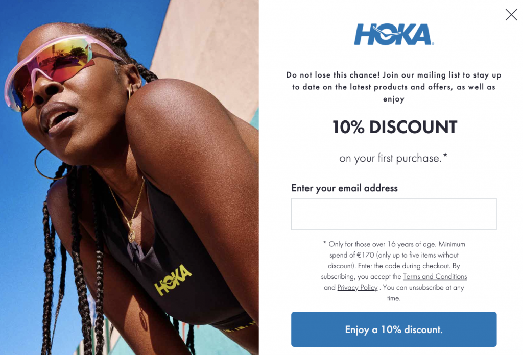
Personalization is another feather in the popup’s cap. With the right tools, e-commerce sites can display popups based on specific user behaviors or browsing patterns, making each message feel tailor-made. Imagine visiting a site and being greeted with a popup offering a special deal on an item you’ve been eyeing but haven’t committed to buying. That’s not just marketing; that’s mind reading.
Moreover, popups can play a pivotal role in customer retention strategies. From loyalty program invites to feedback requests, these interactive elements can enhance the user experience by making customers feel valued and heard.
In essence, when wielded with wisdom and wit, popups can transform from mere digital interruptions to powerful engagement tools. They bridge the gap between passive browsing and active engagement, turning the e-commerce experience into a two-way conversation filled with potential and promise. So, the next time you encounter a popup, remember: there’s a world of strategic thought behind that little window, aiming to make your online shopping journey just a bit more bright.
Best Practices for Effective Popups
Crafting popups that strike the right chord with visitors doesn’t have to feel like solving a Rubik’s Cube blindfolded. It’s all about nailing the basics and then adding your unique twist. Here’s how to make sure your popups are less “Please, not now!” and more “Hey, that’s pretty cool!”
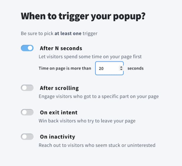
1. Timing is Everything: Imagine popping the question on a first date. Awkward, right? That’s what ill-timed popups feel like. The golden rule? Give visitors enough time to engage with your content before making your move. Exit-intent popups, which appear just as someone is about to leave your site, can be a game-changer, capturing attention without disrupting the browsing experience.
2. Less is Often More: Bombarding visitors with popups is like being at a party and having someone constantly talk over the music. Annoying, isn’t it? Limit the number of popups to avoid overwhelming your audience. One well-placed, well-timed popup can do the job more effectively than a barrage of messages.

3. Make It Personal: Tailoring your message to match the visitor’s journey on your site can turn a generic interruption into a welcome suggestion. Use browsing behavior, location, and past interactions to personalize your popups. It’s like receiving a gift that’s been picked out just for you—thoughtful and engaging.
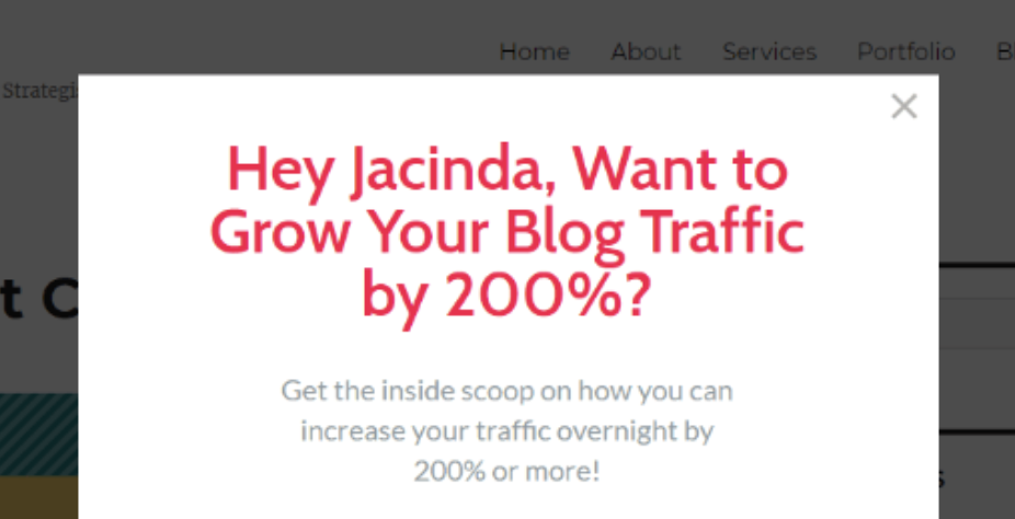
4. Design with Purpose: Your popups should feel like an integral part of your site, not an afterthought. Ensure they match your brand’s look and feel, with clear, concise messaging and a call to action (CTA) that’s hard to resist. Also, making them easy to close is key—nothing tests patience like a popup that’s like a puzzle to dismiss.
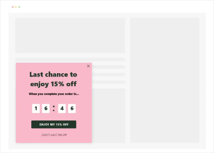
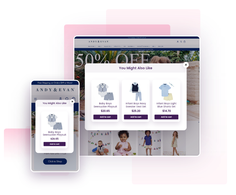
5. Mobile Matters: With more than half of web traffic coming from mobile devices, your popups need to play nice with smaller screens. Responsive design ensures that your popups are just as effective (and non-intrusive) on a phone as they are on a desktop.
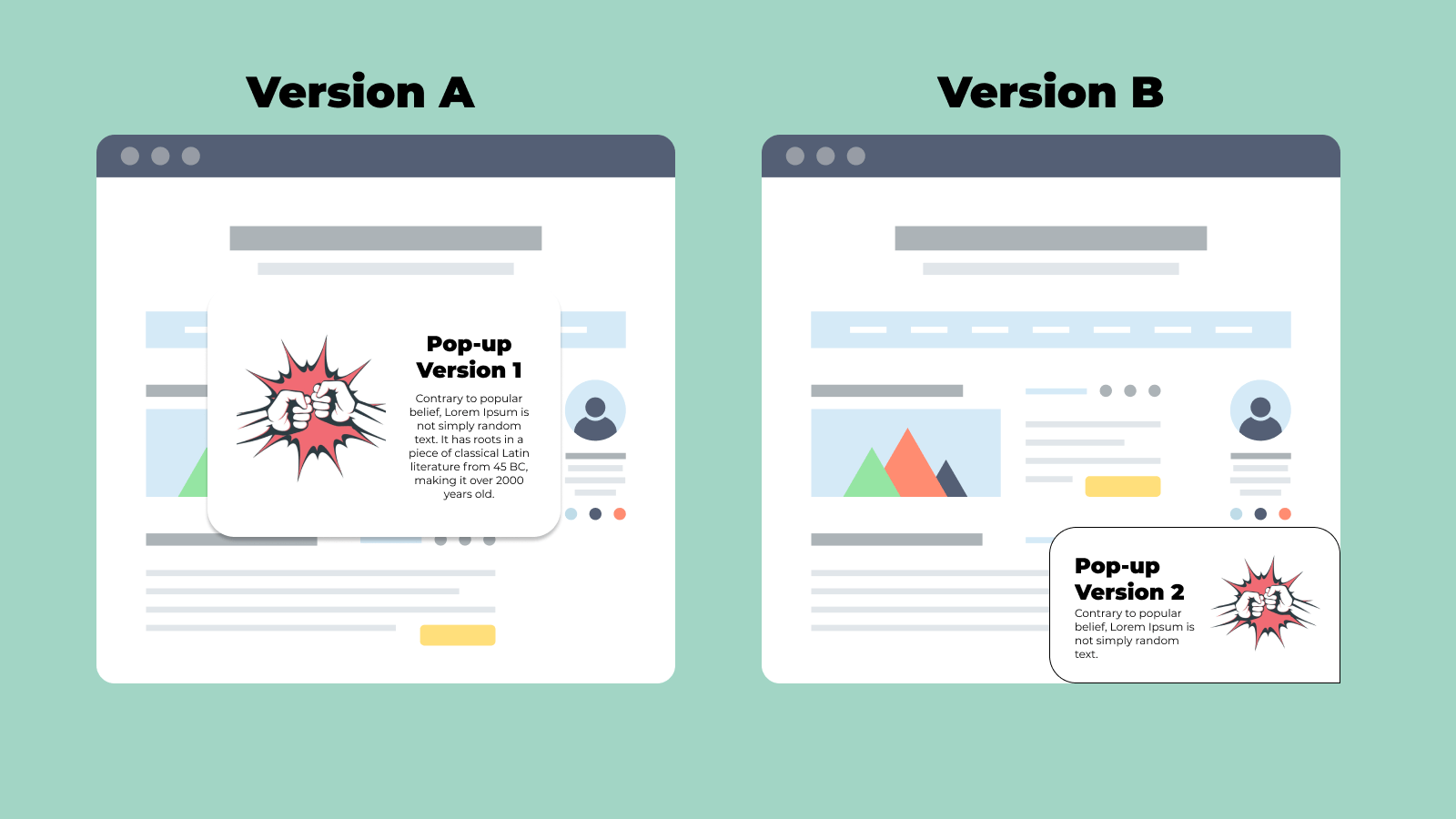
6. A/B Testing: Your Secret Weapon: What works for one site might not work for yours. A/B testing allows you to play mad scientist, experimenting with different versions of your popups to see what resonates best with your audience. Test everything from the copy and design to the timing and placement to find your sweet spot.
Incorporating these best practices can transform your popups from digital door-to-door salesmen into welcome guests, offering value and enhancing the user experience. Remember, the goal is to make your popups so good that visitors might just miss them when they’re gone. Now, that’s when you know you’ve hit the popup jackpot.
Successful Real-world Examples
Diving into the world of popups, it’s clear that when done right, they can be a powerful tool in a marketer’s arsenal. Let’s shine a spotlight on two real-world companies that have turned the often-maligned popup into a cornerstone of their marketing success. Their stories not only inspire but also serve as a blueprint for how to do popups the right way.
Asos: The Personal Touch
Asos, a global fashion giant, has mastered the art of engaging visitors with popups that feel more like a personal shopper than an annoying ad. Their approach? A simple, yet incredibly effective, email signup popup that greets first-time visitors. What sets Asos apart is the personalization and immediacy of their offer: a discount on the first purchase in exchange for an email address.
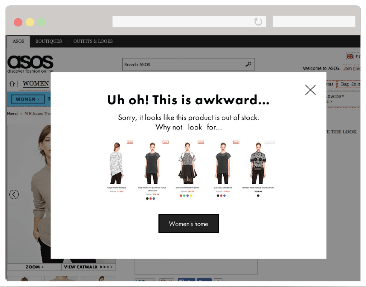
But here’s where Asos shines: the follow-up. Once you’re in their system, they use your browsing habits and purchase history to send personalized recommendations and offers through email. This not only boosts their sales but also enhances the customer experience, making shoppers feel understood and valued. It’s a classic win-win, powered by a deceptively simple popup that’s carefully integrated into a broader personalized marketing strategy.
Airbnb: Mastering the Art of Personalized Offers
Airbnb, the global platform that revolutionized how we travel and stay in places around the world, provides a compelling example of how to use popups effectively for both engagement and conversion. Their strategy focuses on personalized offers and reminders that resonate with the users’ travel preferences and search history.
One standout tactic involves their use of popups to remind users of unfinished bookings or to nudge them about wishlist items that are becoming popular. For instance, if a user was looking at listings in Paris but didn’t complete a booking, Airbnb might deploy a popup during their next visit, offering a gentle reminder or suggesting a special offer on similar listings.
![2021] How to Get a $65 AIRBNB Coupon Code -- (Verified Code)](https://www.dreamystays.com/wp-content/uploads/2020/08/get-65.jpg)
This personalized approach extends to first-time visitors too, with Airbnb often using popups to offer a discount on their first booking if they sign up for an account. This not only incentivizes account creation but also makes the user feel immediately valued and welcomed.
The effectiveness of Airbnb’s popup strategy is evident in their continued growth and user engagement rates. By leveraging data to deliver timely, relevant popups, Airbnb enhances the user experience, making it more likely for browsers to become bookers. Their success underscores the power of personalization in popups, proving that when done right, these tools can significantly impact conversion rates and customer loyalty.
Airbnb’s approach to popups exemplifies how strategic, user-focused interventions can seamlessly guide users from consideration to action, all while maintaining a positive, engaging user experience. Their success story is a testament to the potential of well-crafted popups to not only drive immediate business results but also to build long-term relationships with users.
Ethical Considerations and Best Practices
in the digital age, where data is as valuable as currency, ethical considerations in deploying popups take center stage. Businesses must tread this line with care, ensuring they respect their users’ privacy and consent while striving to enhance user experience and engagement.
Firstly, transparency is key. Users should always be informed about what they’re signing up for when they interact with a popup. Whether it’s subscribing to a newsletter or accepting cookies, clear and concise information helps build trust. This includes easy-to-understand language about how their data will be used, stored, and protected.
Consent is another cornerstone of ethical popup usage. It’s not just about legal compliance with regulations like GDPR and CCPA; it’s about respecting user autonomy. Ensuring that consent is freely given, through clear opt-in mechanisms, reinforces respect for the user. Additionally, providing an effortless way to opt-out or close popups without penalty or excessive hassle respects the user’s choice and enhances their overall experience.
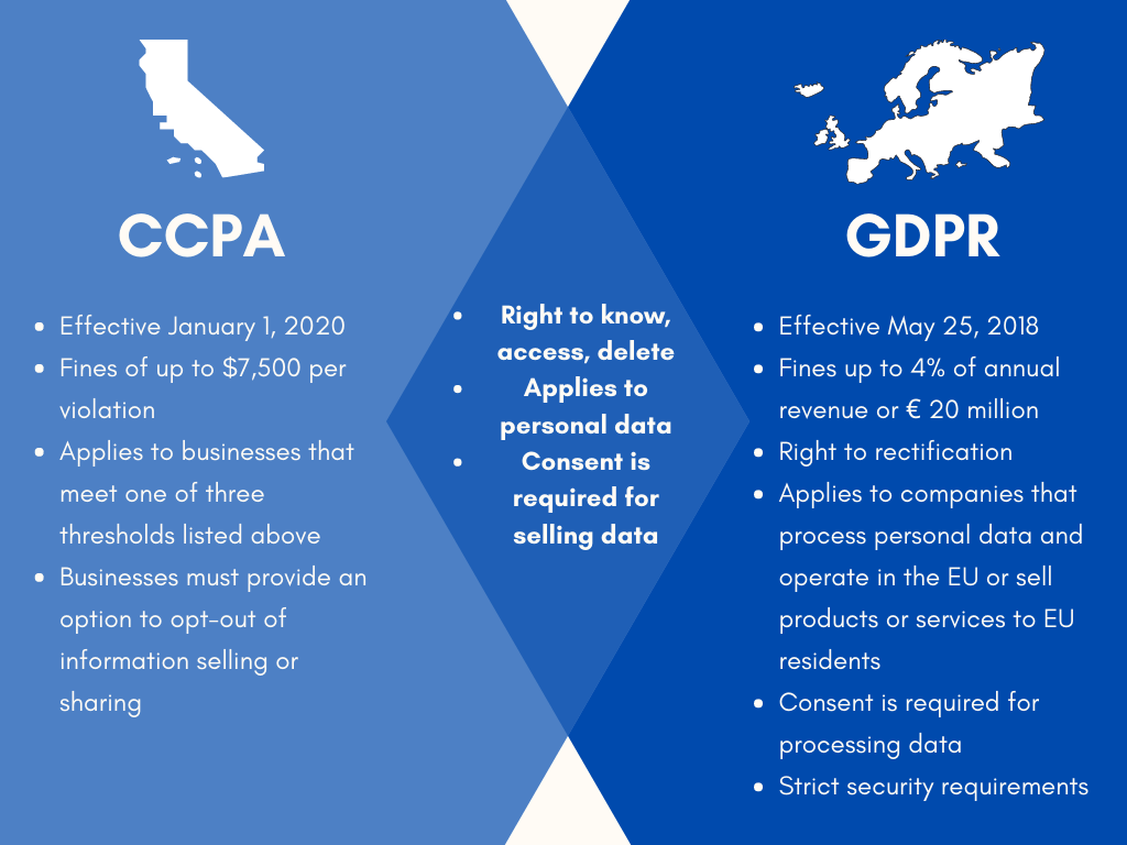
Lastly, consider the user’s journey and experience. Ethical popups should add value, not detract from the content or bombard the user with irrelevant messages. This means deploying popups at appropriate times, in contextually relevant situations, and in a manner that is considerate of the user’s intent and engagement level.
By adhering to these ethical considerations and best practices, businesses can use popups not only to achieve their marketing goals but also to foster a positive, respectful relationship with their audience. In doing so, they turn potential digital disruptions into opportunities for meaningful engagement and trust-building.
Conclusion
As we wrap up our journey beyond the annoyance of popups, it’s clear that when crafted with care, strategy, and a touch of creativity, these digital interjections can transform from mere distractions into powerful tools for engagement and conversion. The key lies in striking that delicate balance between catching the user’s attention and providing genuine value, all while maintaining respect for their online experience and privacy.
The examples of Asos and Airbnb have shown us that with the right approach, popups can significantly enhance the e-commerce landscape, turning casual browsers into loyal customers. By adhering to best practices—timing popups thoughtfully, personalizing messages, designing with the user in mind, and always prioritizing ethical considerations—we can ensure that popups serve as a bridge to deeper customer relationships rather than a barrier.
In the end, the goal is to create a popup strategy that feels less like an interruption and more like a value-added conversation. By doing so, we not only boost our metrics and meet our business objectives but also respect and enrich the user experience. Here’s to popups that people actually look forward to—a testament to the innovative, user-focused future of e-commerce.