blog»Conversion Rate Optimization»The Ultimate Fix List for Conversion Rate Optimization in E-Commerce
The Ultimate Fix List for Conversion Rate Optimization in E-Commerce
2025/03/24
You can read this article in about 20 minutes
Introduction
You can have great products, smart ads, and solid traffic—but if your site isn’t converting, none of it matters. That’s why conversion rate optimization in e-commerce is so critical.
The problem? Many brands are unknowingly making small mistakes that have a big impact on conversions. From weak product descriptions to unclear CTAs, these issues quietly push customers away and hurt your bottom line.
The good news: most of these mistakes are fixable. In this article, we’ll walk through 10 common CRO killers we’ve seen in e-commerce stores—plus clear advice on how to fix them.
If you want to turn more visitors into buyers, this fix list is a great place to start.
Let’s dive in.
Mistake #1: Slow Website Load Times
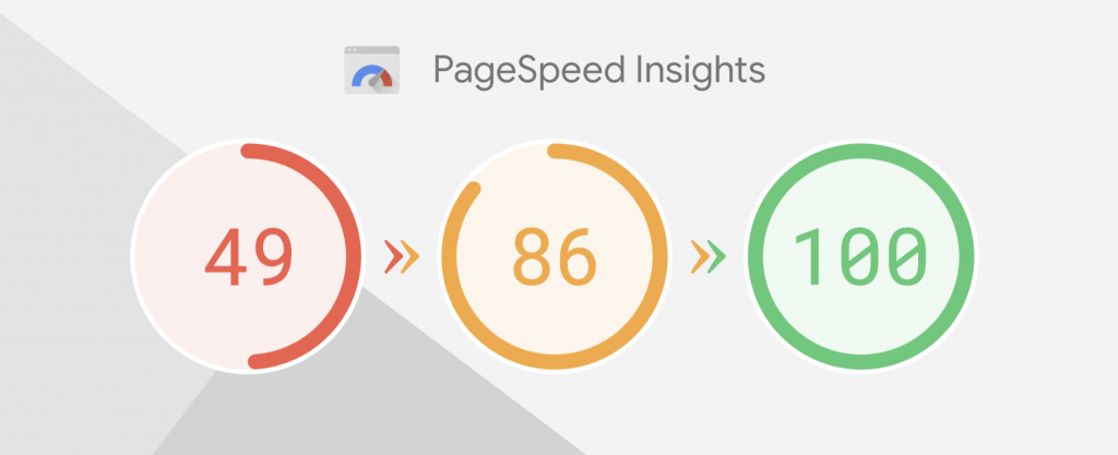
If your site takes too long to load, people leave—simple as that. In e-commerce, every second counts. A delay of just one second can lower conversions by up to 7%, and that number only gets worse on mobile.
Why it’s a problem:
- Shoppers today expect instant experiences.
- Slow sites create friction and erode trust.
- Your ad spend is wasted if users bounce before seeing your product.
How to fix it:
- Use tools like Google PageSpeed Insights or GTmetrix to measure your load time.
- Compress images without losing quality (tools like TinyPNG can help).
- Enable browser caching and lazy loading for faster performance.
- Choose a fast, mobile-friendly theme—and don’t overload it with heavy plugins.
Bonus tip:
Always test on both desktop and mobile. Mobile users are less patient—and more likely to abandon a slow site.
Improving load speed is one of the fastest wins for conversion rate optimization in e-commerce. It’s invisible when done right, but deadly when ignored.
Mistake #2: Weak Product Descriptions
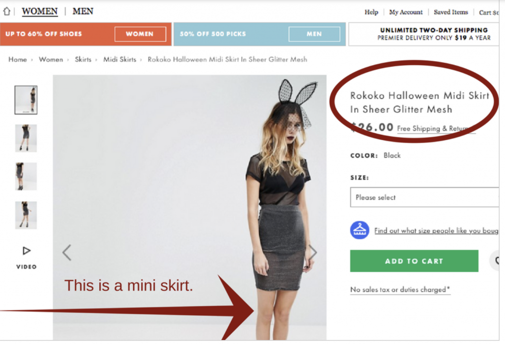
You’ve got great products—but if your descriptions don’t sell them, customers won’t either. One of the most overlooked parts of conversion rate optimization in e-commerce is how you describe what you’re selling.
Why it’s a problem:
- Vague or generic copy doesn’t build trust or interest.
- Features are listed, but benefits are missing.
- The shopper doesn’t see how the product fits their life.
How to fix it:
- Focus on benefits over features—how will this product improve the customer’s life?
- Keep it clear, scannable, and easy to read. Use bullet points, short sentences, and natural language.
- Add emotion or storytelling if it fits your brand.
- Answer common questions within the copy (sizing, use cases, care instructions, etc.).
Bonus tip:
Use your customer reviews to inspire your copy. Real customer language can make your descriptions feel more authentic and relatable.
Improving product descriptions is a simple way to boost trust and clarity, both essential for conversion rate optimization in e-commerce.
Mistake #3: No Trust Signals
You could have the best site design in the world, but if shoppers don’t trust you, they won’t buy. Lack of trust signals is a silent killer when it comes to conversion rate optimization in e-commerce.

Why it’s a problem:
- New visitors don’t know who you are.
- Without reviews or reassurance, they hesitate—especially with higher-priced products.
- Shoppers are cautious about scams, slow shipping, or poor service.
How to fix it:
- Add customer reviews and ratings directly on product pages.
- Use security badges (SSL, payment provider logos) at checkout.
- Include clear return and refund policies—and make them easy to find.
- Highlight free shipping, guarantees, or satisfaction policies if available.
- Add real social proof—such as customer photos, testimonials, or “as seen in” badges.
Bonus tip:
A simple trust badge near your “Add to Cart” button can reduce friction and improve conversions—especially for first-time buyers.
Trust is a foundation of e-commerce conversion. Build it early and visibly, and your conversion rate will thank you.
Mistake #4: Unclear Call to Action (CTA)
If visitors don’t know what to do next, they’ll do nothing. A weak or confusing CTA is one of the most common—and easily fixable—issues in conversion rate optimization for e-commerce.
Why it’s a problem:
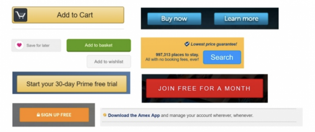
- CTAs that blend into the page are easy to ignore.
- Generic phrases like “Submit” or “Click Here” don’t create urgency.
- Too many buttons on one page leads to decision fatigue.
How to fix it:
- Use action-oriented language: “Add to Cart,” “Get Yours Now,” or “Unlock 20% Off.”
- Make sure the button stands out visually—use contrast, size, and spacing.
- Limit the number of CTAs per page. One main goal per screen is ideal.
- Place CTAs in logical, visible spots (above the fold, near product images, end of product descriptions).
Bonus tip:
Test different CTAs with A/B testing—changing just a few words can improve click-through rates significantly.
A strong, clear call to action keeps your shopper moving forward. And that momentum is key for effective conversion rate optimization in e-commerce.
Mistake #5: Poor Mobile Experience
Mobile traffic often makes up 50% or more of an e-commerce store’s visitors—yet many brands still treat mobile design as an afterthought. That’s a big miss for conversion rate optimization in e-commerce.
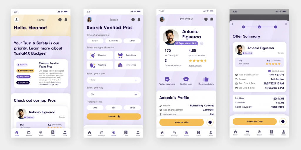
Why it’s a problem:
- Sites that look great on desktop can be clunky or hard to navigate on smaller screens.
- Text may be too small, buttons too close together, or product images hard to view.
- A poor mobile checkout flow = high bounce and cart abandonment.
How to fix it:
- Use a mobile-first design approach—start with the smallest screen, then scale up.
- Keep navigation simple and intuitive, with sticky menus and big, tappable buttons.
- Optimize images to load fast without losing quality.
- Test your site across devices (especially the checkout flow) to catch any friction points.
Bonus tip:
Use heatmaps or session recordings to see where mobile users drop off or struggle.
Improving the mobile experience isn’t optional—it’s essential. If your site doesn’t work smoothly on a phone, you’re losing sales, no matter how strong the offer.
Mistake #6: Not Using Visual Hierarchy to Guide the Shopper
A cluttered layout or poor use of design elements can confuse visitors—even if your content is great. Without clear visual hierarchy, shoppers don’t know where to look or what to do next, which hurts conversion rate optimization in e-commerce.
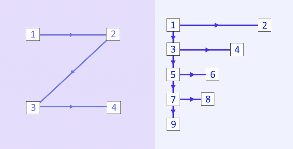
Why it’s a problem:
- Key elements like CTAs, product benefits, or pricing don’t stand out.
- Pages feel overwhelming or disorganized, leading to quick exits.
- Visitors miss important information simply because of how it’s presented.
How to fix it:
- Use bold headlines, subheadings, and visual contrast to guide attention.
- Make your main CTA the most prominent element on the page.
- Use whitespace to group related content and let the page “breathe.”
- Maintain a clear flow from top to bottom, with logical order and visual balance.
Bonus tip:
If everything on the page is loud, nothing stands out. Prioritize your message and design accordingly.
Visual hierarchy isn’t about flashy design—it’s about clarity and flow. When shoppers can process your page easily, they’re far more likely to convert.
Mistake #7: No Clear Value Proposition
If a visitor lands on your site and doesn’t immediately understand why they should buy from you, you’ve lost them. A weak or missing value proposition is a silent killer when it comes to conversion rate optimization in e-commerce.
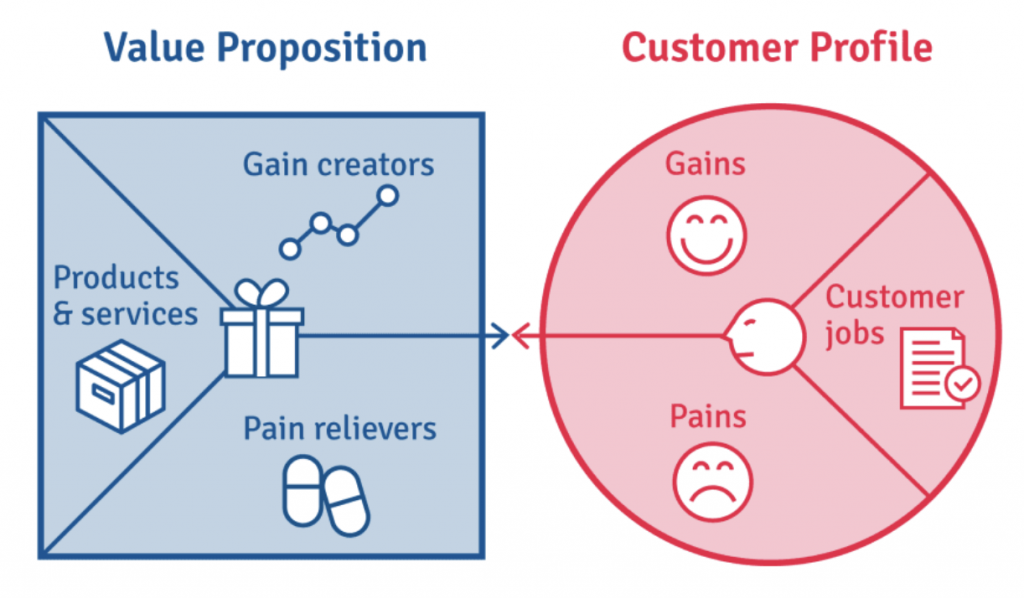
Why it’s a problem:
- Shoppers don’t know what sets you apart from competitors.
- Generic taglines like “Great Products, Great Prices” say nothing meaningful.
- You’re relying on your product alone to do the selling—and that’s not enough.
How to fix it:
- Craft a clear, specific value proposition that answers: “Why buy from us?”
- Highlight it above the fold, on product pages, and in key landing areas.
- Focus on real benefits—fast shipping, eco-friendly packaging, better quality, exclusive items, etc.
- Use plain, confident language. Skip the fluff.
Bonus tip:
Try the “5-second test.” Show someone your homepage for five seconds. If they can’t tell what you sell and why it’s better, it’s time to revise.
In a crowded market, clarity is power. A strong value proposition builds confidence fast—and that’s a key win for conversion rate optimization in e-commerce.
Mistake #8: Lack of Urgency or Scarcity
If shoppers don’t feel a reason to act now, they often don’t act at all. A missing sense of urgency or scarcity can quietly stall your sales—and slow down your conversion rate optimization in e-commerce.
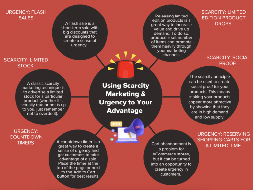
Why it’s a problem:
- Without time-sensitive language or stock indicators, shoppers feel no pressure to buy.
- Visitors may plan to “come back later” and never do.
- You miss the chance to tap into impulse buying behavior.
How to fix it:
- Use limited-time offers, flash sales, or countdown timers.
- Highlight low stock warnings (“Only 3 left!”) or limited-edition products.
- Add urgency in your CTAs: “Buy Now,” “Claim Your Spot,” “Offer Ends Tonight.”
- Use urgency sparingly and honestly—false scarcity erodes trust.
Bonus tip:
Use urgency with personalization. For example, send browse abandonment emails with messaging like, “Only a few left in your size.”
Done right, urgency turns hesitation into action—and that leads to higher conversions and stronger results from your e-commerce CRO efforts.
Mistake #9: Ignoring Customer Support Visibility
Many online stores focus so much on selling that they forget about support visibility. If customers can’t find help when they need it, they hesitate—or worse, leave. This directly impacts conversion rate optimization in e-commerce.

Why it’s a problem:
- Unanswered questions = lost trust and missed sales.
- Lack of visible support can make your store feel less reliable.
- Shoppers may abandon carts simply because they’re unsure about returns, sizing, or delivery.
How to fix it:
- Add live chat or chatbots to key pages (product, cart, checkout).
- Make support options easy to find—include links to your FAQ, returns, and contact page in the footer and during checkout.
- Use tooltips or help icons for common questions right where shoppers need them.
- Clearly communicate response times if chat isn’t available 24/7.
Bonus tip:
Even a simple “Have a question?” link near your “Add to Cart” button can reduce hesitation and boost trust.
Support isn’t just a post-purchase thing—it’s part of the buyer journey. Make it easy to get answers, and you’ll reduce friction and improve your e-commerce conversion rates.
Mistake #10: Not Using Data to Improve
If you’re not looking at how users behave on your site, you’re guessing. And in e-commerce, guessing leads to missed opportunities. Ignoring your data is one of the biggest blockers to real conversion rate optimization in e-commerce.
Why it’s a problem:
- You don’t know where people drop off or why they don’t convert.
- Without data, it’s hard to prioritize what to fix.
- Decisions are made on gut instinct, not actual user behavior.
How to fix it:
- Use tools like Google Analytics or Ptengine to track user activity.
- Analyze bounce rates, heatmaps, and session recordings to identify friction points.
- Set up conversion goals and funnels to measure each step of the user journey.
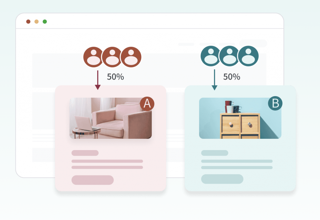
- Run A/B tests on headlines, CTAs, product pages, or checkout flows.
Bonus tip:
Don’t just look at vanity metrics—focus on actions that lead to sales: clicks, cart adds, checkouts started, purchases completed.
Your data holds the clues to what’s working and what’s not. By using it consistently, you turn guesswork into growth—and that’s the heart of real e-commerce CRO.
Summary: The Ultimate Fix List for Conversion Rate Optimization in E-Commerce
If your store isn’t converting, it’s time for a tune-up. Here are the 10 most common mistakes that could be holding you back—and what to do about them:
- Slow Website Load Times – Speed matters. Optimize for fast performance across all devices.
- Weak Product Descriptions – Focus on benefits, not just features. Make your copy clear and persuasive.
- No Trust Signals – Add reviews, guarantees, and secure payment badges to build confidence.
- Unclear Call to Action (CTA) – Use bold, action-oriented buttons with clear intent.
- Poor Mobile Experience – Design mobile-first with simple navigation and fast load times.
- No Visual Hierarchy – Guide the shopper’s eye with clear structure and design flow.
- No Clear Value Proposition – Tell visitors why they should buy from you—right away.
- Lack of Urgency or Scarcity – Use limited-time offers or low-stock indicators to spark action.
- Invisible Customer Support – Make help easy to find, especially at key moments in the journey.
- Not Using Data to Improve – Use heatmaps, analytics, and A/B testing to make informed decisions.
Fixing just a few of these issues can make a huge difference in your results. Start with what’s easiest to implement—and build from there.