VIPKid - Online Education Company
How did VIPKID use Ptengine to triple the number of teacher registrations?
- Website optimization - Signups increased by 150%
- Pop-up window interaction - adding an additional 5,000 candidate leads per month.
- Online form optimization - increase by 150%
- The overall conversion rate increased 3 times.
VIPKID Conversion Rate Optimization Manager
Lee Ban Li

Do you know the mystery of their growth?
They use Ptengine to appreciate the essence of growth. Are you still worried about growth? Feeling difficult? Let's sign up for Ptengine today, let us tell you what to do.
Start your growth
A 150% increase in conversion rate?How Ban implemented Ptengine to recruit more teachers.
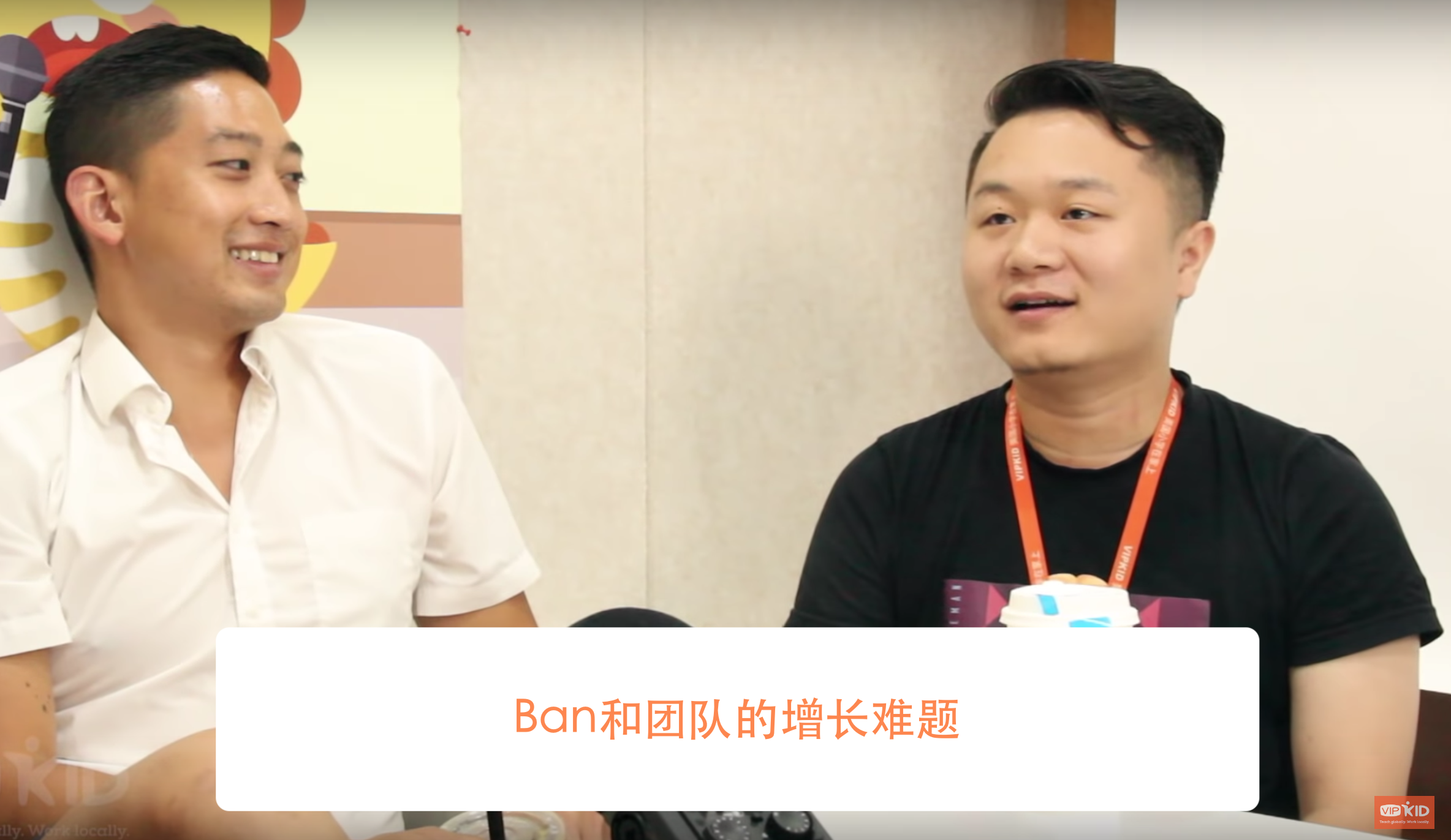
VIPKID is the children's international education for Rice Future Technology Co., Ltd., dedicated to creating an authentic online foreign language classroom for the younger generation. VIPKID Conversion Rate Optimization Manager, Ban Li is responsible for increasing the number of online teachers in North America. His team's core KPI is “the number of qualified teachers” registered on the platform.
Between 2017 and 2019, the VIPKID online foreign language course was at a critical stage of business expansion. To meet the surge in demand for their courses, they needed to recruit a larger number of foreign teachers to maintain growth. It was also at a time that Ban began to realize that it was their website that was the main tool to drive conversions and it was critical to optimize it. So, within the growth team, he began to promote the use of Ptengine.
The team's role included online operations, website promotion, online event planning, etc. Through Ptengine's visual data back-end, everyone was on the same page and could see the performance of their “Teacher Recruitment Website.”
As a result, the whole team was able to see how users were interacting with the site. At the same time, the operation team was able to interact with the webpage without having to seek the resources from the product and technical teams. This meant that their ideas and marketing strategies were implemented quickly.
“Ptengine is easy to use, but the logic is very powerful. Not only can it bring intuitive insight into traffic behavior, but the new engage feature also helps us quickly validate various assumptions, seize marketing opportunities, and improve conversions. For example, after a simple revision, user interaction on our site is more intuitive and effective, and the conversion rate for recruiting teachers has increased by 150%!”

Ban's challenges
Challenge 1: Needed to move, fast!
“We needed exponential growth NOW.” To meet the demands of the new marketing strategy, the number of North American teachers had to be doubled within a few months. Ban, who has rich marketing experience, wanted to start from the most basic user (teacher) experience flow. By looking at the transformation funnel, he found one link that had been ignored—the flow of the site that encouraged teachers to complete the registration.
Compared with the industry average, the registration conversion rate for VIPKID had been several times higher, so everyone thought that there was no room for improvement. However, because of his CRO experience in the UK, Ban held the concept of “optimization is endless”, “so there must be room for improvement”. Ban's challenge was to now, "break through the layers of red-tape and approval between departments, to quickly modify the website to make this layer of optimization agile. “Is there any way to achieve the desired website revision effect without using other departments' resources?”
Challenge 2: Needed to optimize the site
One of the keys to the continued growth of VIPKID's children's English business was the quality of teachers. The first step in ensuring quality is the “long” teacher registration form – each candidate needs to fill out an extensive onboarding form, which sets firm requirements for teacher recruitment.
Through Ptengine, Ban conducted data monitoring and analysis on website traffic and found that this extensive form was the “killer” that caused the registration rate to be lower than its potential. A large number of registered users failed to pass the “patience test” and were scared away by this terrible long form. Here was the problem. Without improving the conversion rate of this extensive form, his department could not meet the KPI. However, he still couldn't reduce this form! He needed more insight!
Ban's Solution
Using Ptengine's heat map to analyze the web traffic behavior, Ban discovered that users who are attracted by external advertisements will not spend time on the VIPKID brand introduction section. They pay attention to the “teachers can get benefits” part, namely “ If I become a teacher of VIPKID, what can I get?"
With a specific discovery process is like this. Ban used Ptengine to segment users so that the heat map only showed the browsing behavior of users who failed to convert. As shown in the group below, the brand introduction module below the banner of the first screen, the user's turnover rate was as high as 73%! When the user browsed to the cooperative equity module below, the churn rate was almost 0%, indicating that the user is more interested in this content! But the design of the website meant that only 23% of users saw that module.


Ban came up with a hypothetical conclusion: for the teachers who came to the site, what did the want to know? Probably how much extra income they can earn as a part-time teacher?
Ban's solution: Put the "teacher's income” content on the front page, so that users will see it as soon as they land on the home page.

To verify this hypothesis, Ban first started with the Call-to-Action button and changed it from “SIGN UP” to “Start Earning”. Due to the huge traffic on the homepage, the results of the A/B test significant: the conversion rate of the original button did not improve, but the new version increased conversion rates by 38%. Ban was more confident in his assumptions. He plans to switch the brand's slogan and introduction module at the top of the homepage to the "Teacher's Rights" module and continue the A/B testing.
"Say change and change fast, Let A/B test results speak for themselves!"
The old version of the homepage is shown below. The slogan “Part-time Teaching, Full-time Fun!” didn't yield the results Ban needed.

As shown below, Ban changed the main slogan on the left side of the new home page to “$22 per hour, teach English online, freely choose to go to work, and be your own boss.” ( Earn up to $22 / hr… )

The bottom of the first picture was also changed from the original content to highlight three teachers benefits:
- Let you focus on inspiring students across China as they learn English.
- You can teach online anytime, anywhere.
- Get Paid.
The A/B test highlighted to Ban and the team owners that they succeeded! The teacher's registration conversion rate increased by 150%. This also meant that page optimization saved the company millions of dollars in marketing expenses.“Optimization is endless, so there is a possibility for continued growth!” Ban did not stop because of success, he believes that continuous optimization is the key to maintaining strong growth.
Continuous Optimisation
Although the conversion rate increased, there was still a large percentage of traffic that had not been converted. Was there another way to increase the conversion rate again? At the same time, Ban also faced a new problem. If continuous optimization is required, it is necessary to constantly rely on other departments for implementation, something that costs time and money. This raises the question of whether this optimization is worth doing if it may be a loss to the business. Ban laughed and found that Ptengine was like seeing into the New World. General changes didn't require the assistant of others and could get what he needed to be done by himself. Ban, now empowered to make changes on his own, decided to deliver articles and personalized messages to those who were about to churn in the hope that users would stay on the site. Ban designed an enticing pop-up for unregistered users which were planning to leave: When the user's mouse moves towards a certain direction, ie they intend to close the page, go back back, or switch page, the site will pop the following message.

The copywriting and design of the pop-up window need to be relevant to the audience. The user gets a suitable message that is delivered in the right place moment and the right moment. We used, “Wait a minute! Do you want to know how much more you can earn next month?”, with the orange button below - "How much can you earn?" After clicking this button, the user enters an income calculator (as shown below). According to their needs and allowances, the user could calculate how much income they could get if they were a VIPKID teacher. We found this to really help get leads to complete the registration process.

What was the result of adding an interactive experience? Look at the evidence.

Results: Single-handedly, in a short amount of time, Ban gained more than 5,000 additional leads a month!
Continuous optimization
Ban thought that perhaps the long-form needed improvements and wanted to see users' behavior and find out where it lost people's attention. The Ptengine heat map showed Ban exactly where his problem was.

(heat map analysis of long forms) Most of the users who gave up on the form did when they were halfway through entering their mobile number. This accounted for 16% of users. Ban believed that this meant that some users do not want to leave a phone number. Because this field was required many just gave up and left the site. Therefore, Ban placed the phone number field at the bottom of the form. The reason was: Because this form was long. He discovered that even if a user would prefer not to disclose their contact number, there were more likely to because they had already taken the time to complete the rest of the form. Ban still performed A/B testing on his hypothesis using Ptengine's Engage and the results were powerful. He found that the completion rate of the new form increased by 150%.
Summary of case results
Ban's victory through targeted messaging and optimization is still continuing today!
- Website Optimisation - registration rate increased by 150%
- Pop-up windows remain in place, adding 5,000 new leads a month.
- 150% increase in the number of people completing the onboarding form.
- Overall conversion rate increased nearly 3 times
Traditionally it would cost a substantial amount of time, money and resources to increase your conversion rates 3x. Through the use of Ptengine, Ban was able to rapidly implement his ideas and test without the help of other departments. Dig deeper into data and optimize, deliver and grow.
More Featured Success Stories

By using Ptengine, one person was able to test his hypothesis without a designer or an engineer, doubling the sales of the warranty service during 11/11 or 'Singles Day' in China.
Read More

RIZAP experienced a 167% increase in application rate after implementing Ptengine. In addition, their form input rate increased 2.5 times and employee data workload reduced from 8 hours to “0 seconds.
Read More